Rita Santos Coaching
Project Type: Brand Design, Website Design
Role: Brand Designer
Rita Santos is an agile product innovation coach transitioning into personal coaching. As she was finishing her coaching certification, she wanted to build her brand and website to begin to onboard clients and establish her coaching practice.
Project Information
Rita’s goal was to create a brand and website that matched her values and the kind of work she ultimately wants to do: personal coaching that comes from expertise and authentic lived experience.
In an extensive brand discovery session Rita described the kinds of clients that she wanted to work with: people navigating life and career transitions, and the kinds of services she wanted to provide which ranged from regular coaching sessions online, to coaching walks in nature and eventually providing group trips to locations that she loves. The challenge was to incorporate these into a coherent brand identity and website that could help her market her services and obtain more clients.
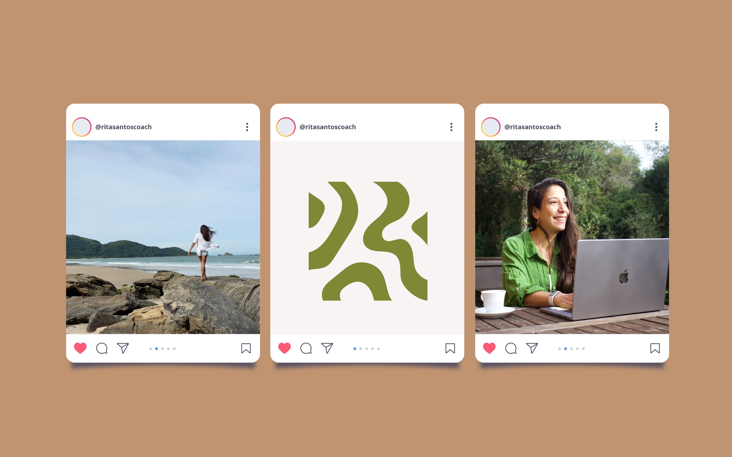
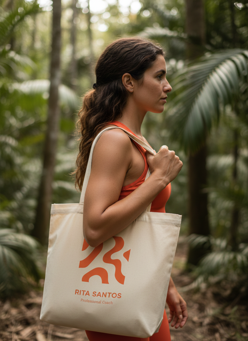
Movement, authenticity, courage, results-oriented were all words that came up during our sessions to define the brand, as well as a pull towards the grounding effect of nature particularly in Rio de Janeiro, a city she lives in and loves. Naturally, the visual direction that Rita chose leant heavily into movement and flow, inspired by nature, while maintaining an overall feel of minimalism, authenticity and approachability.
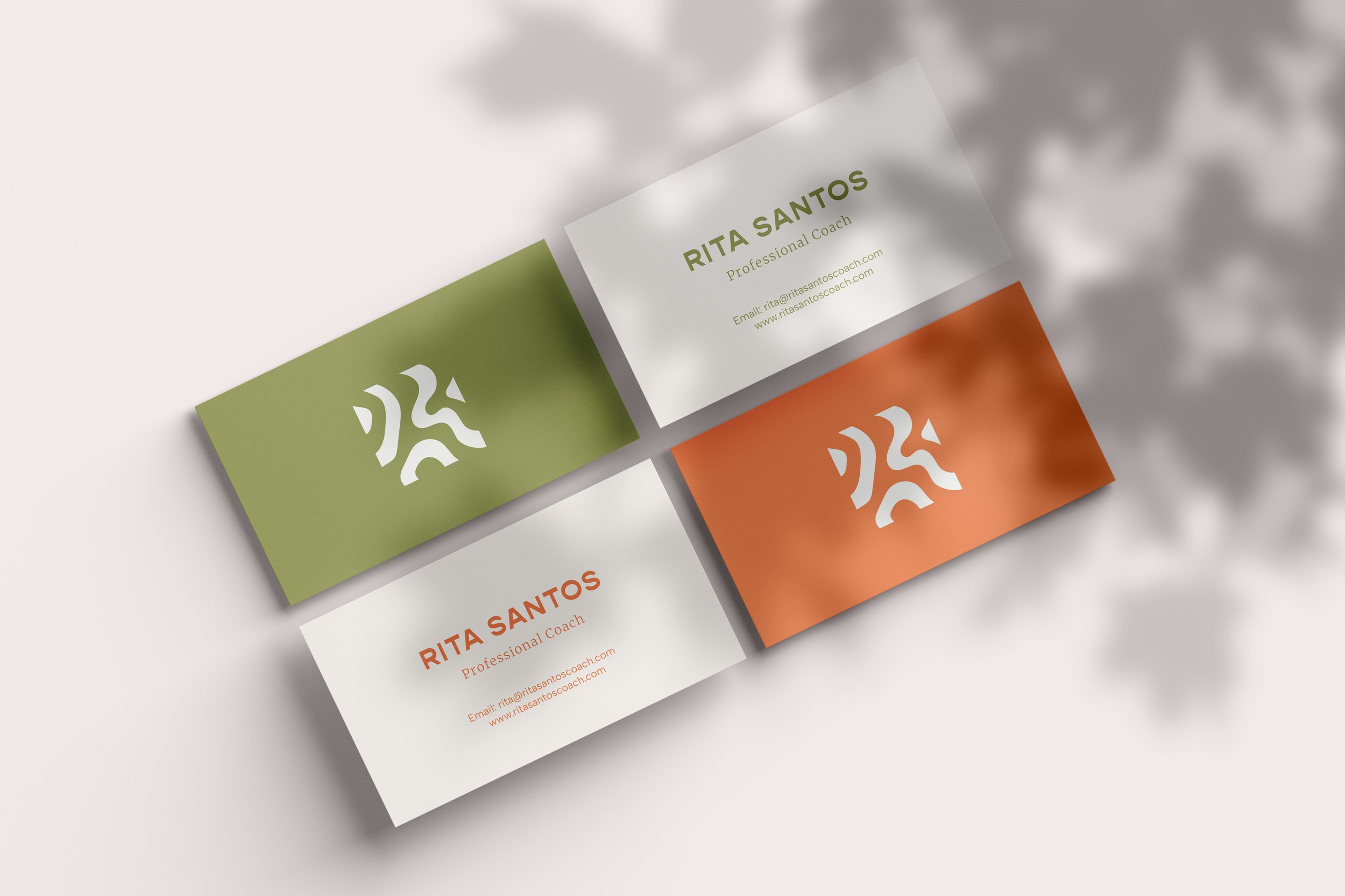
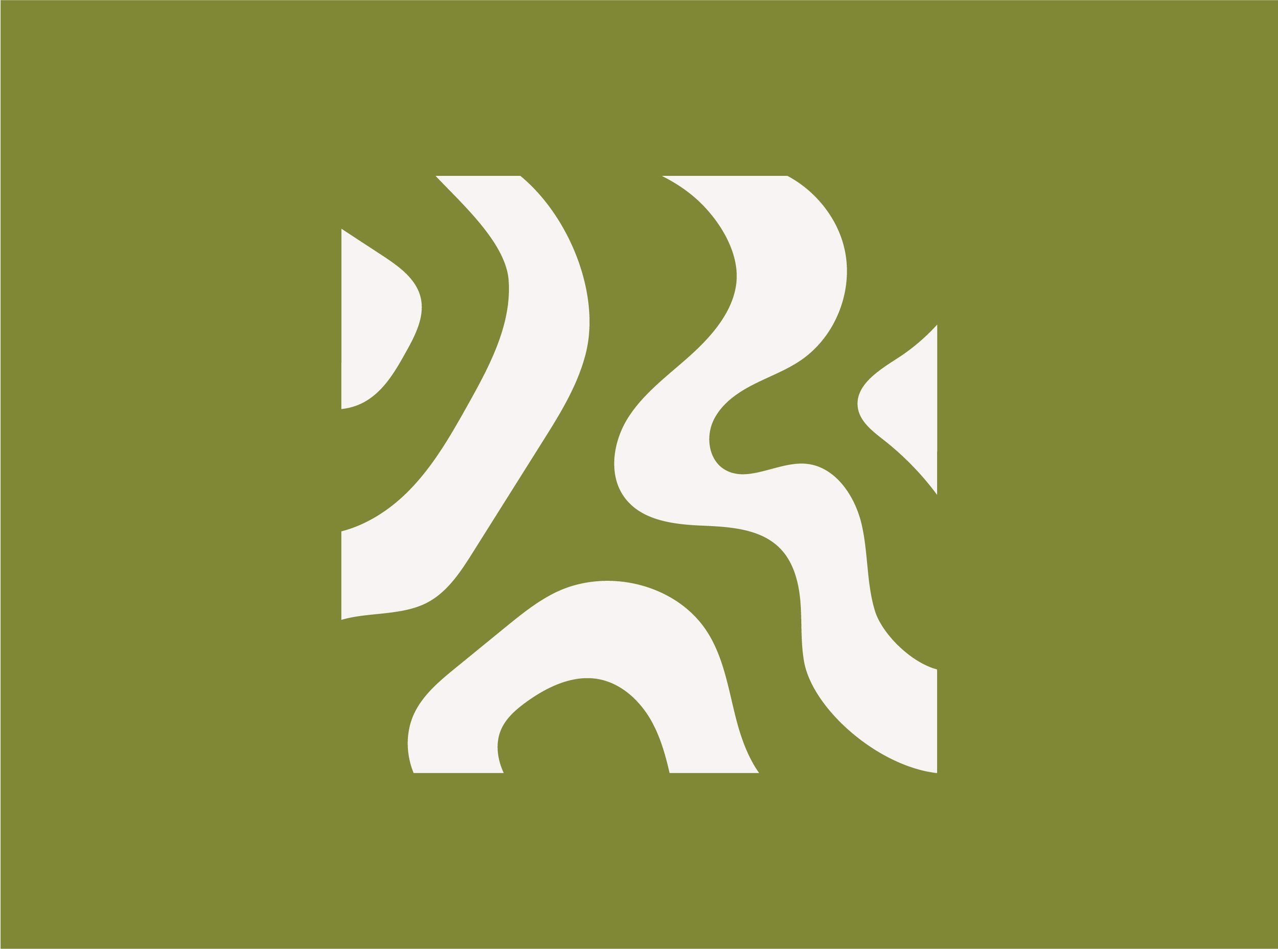
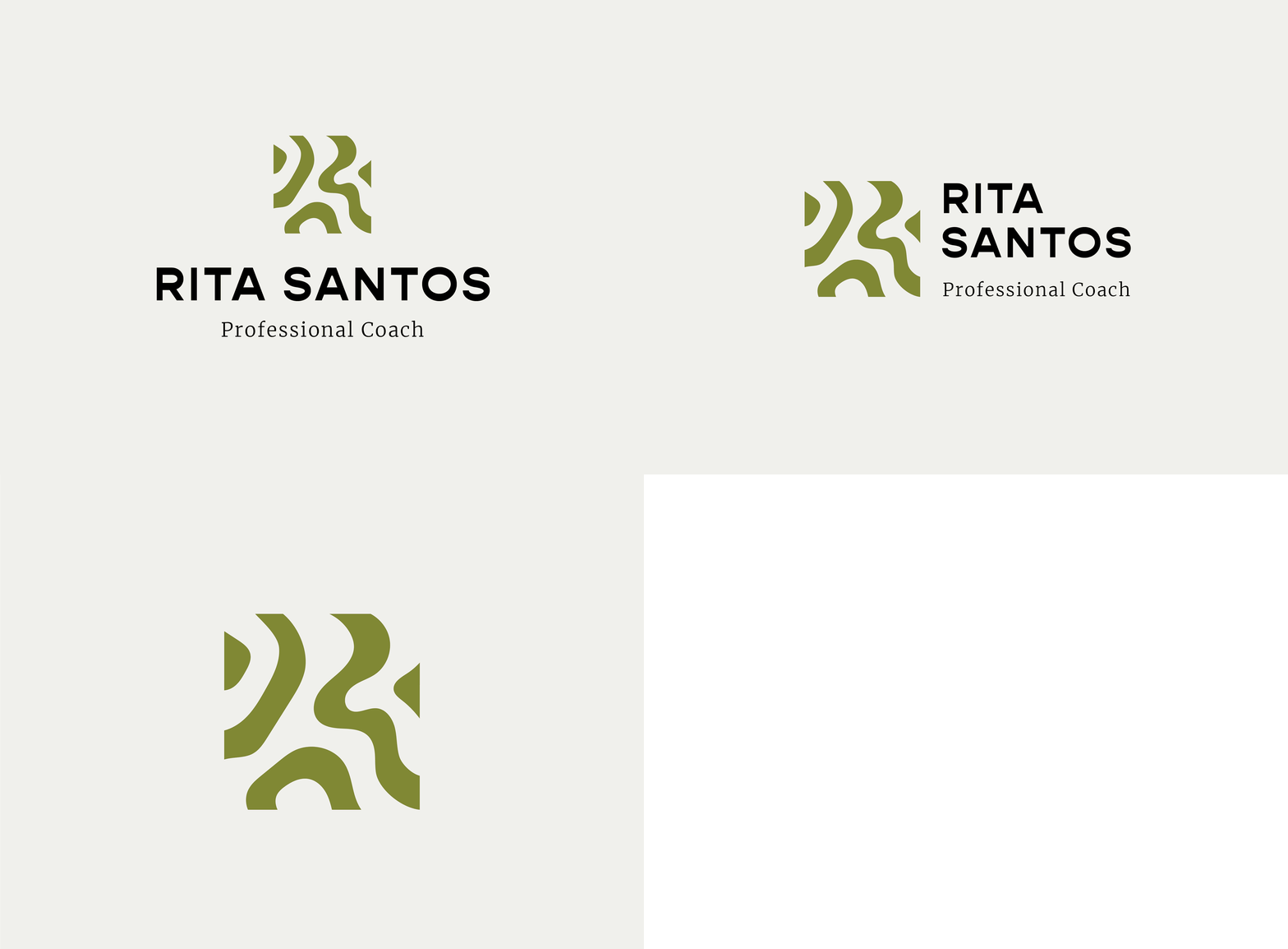
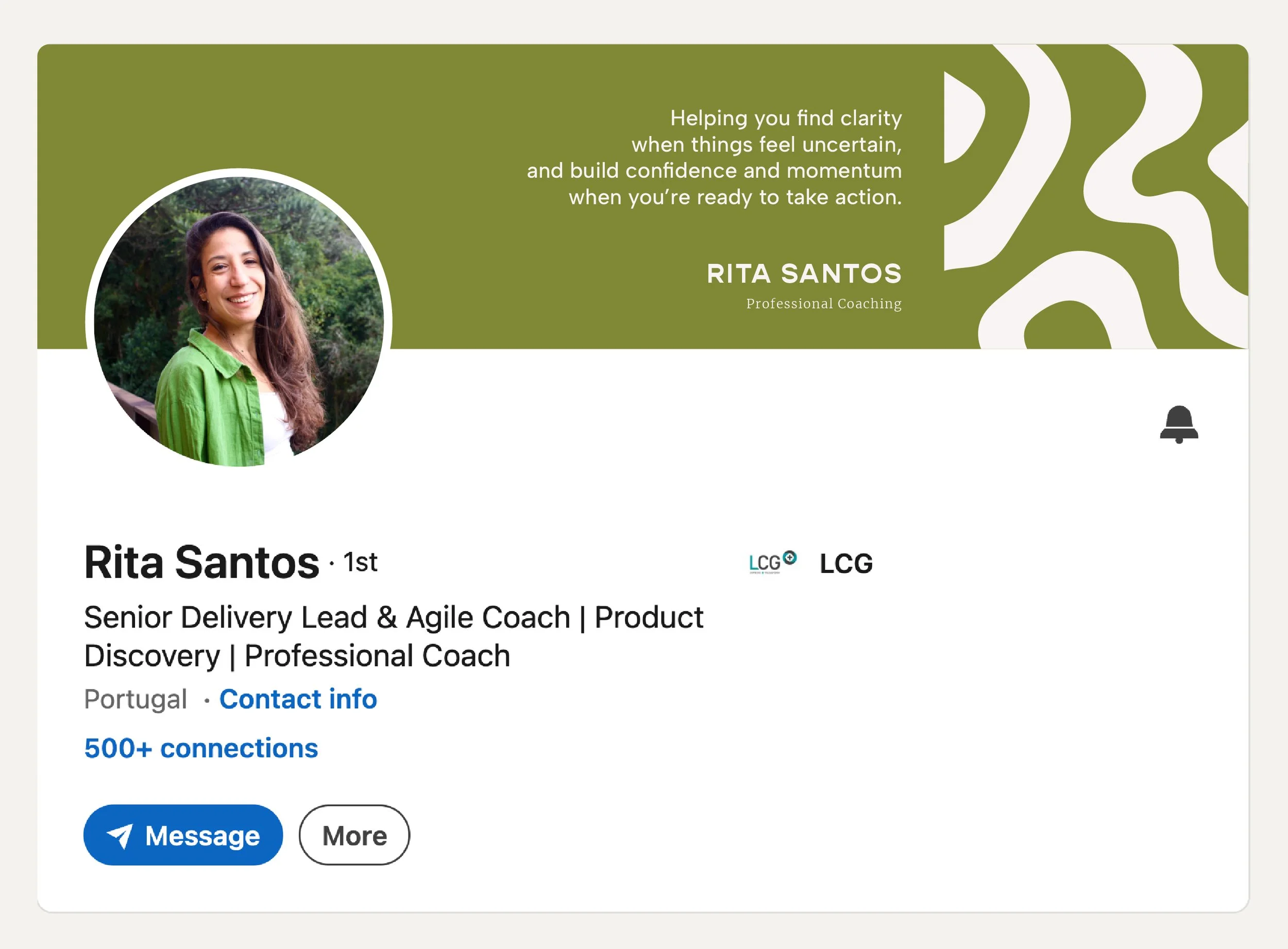
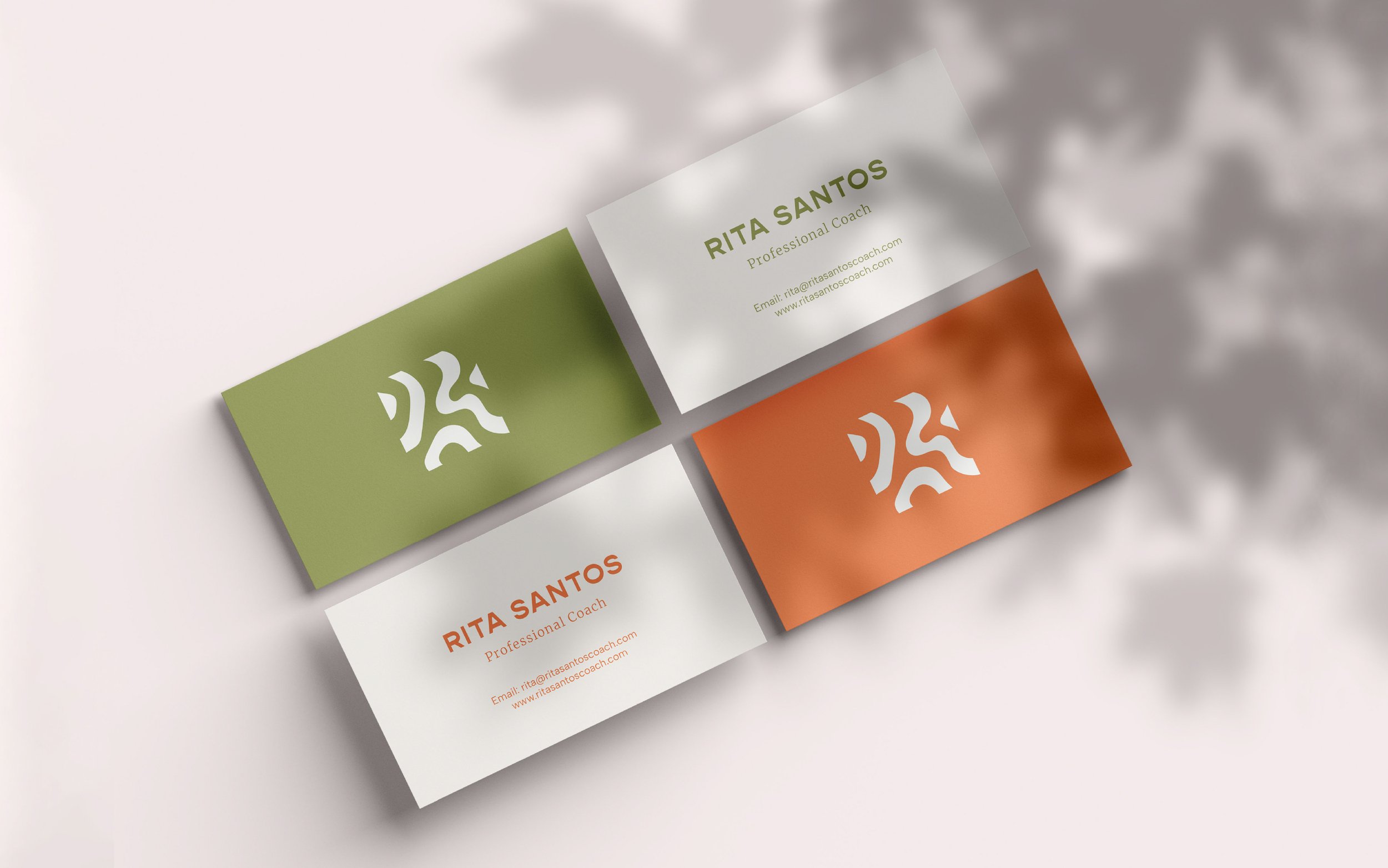
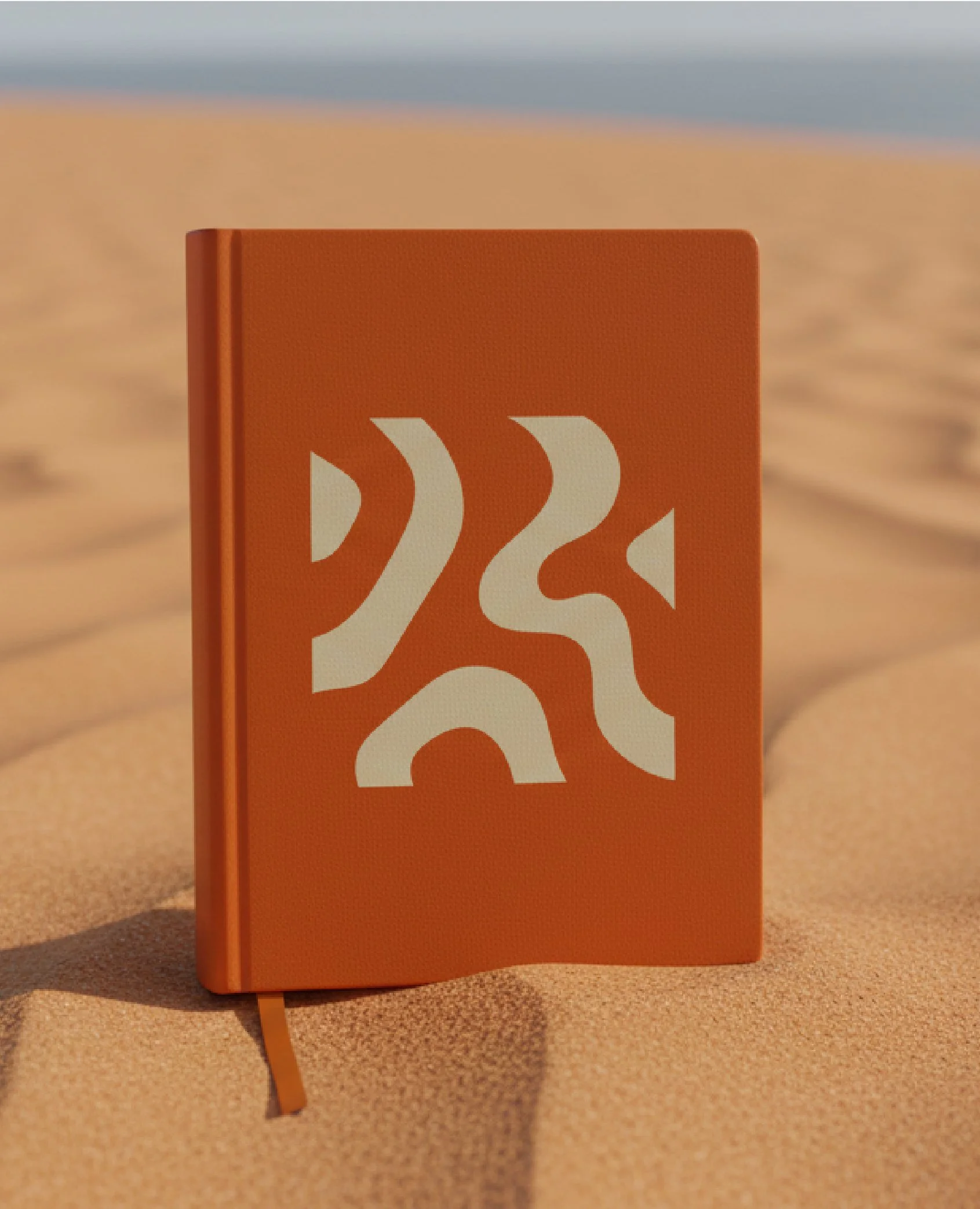
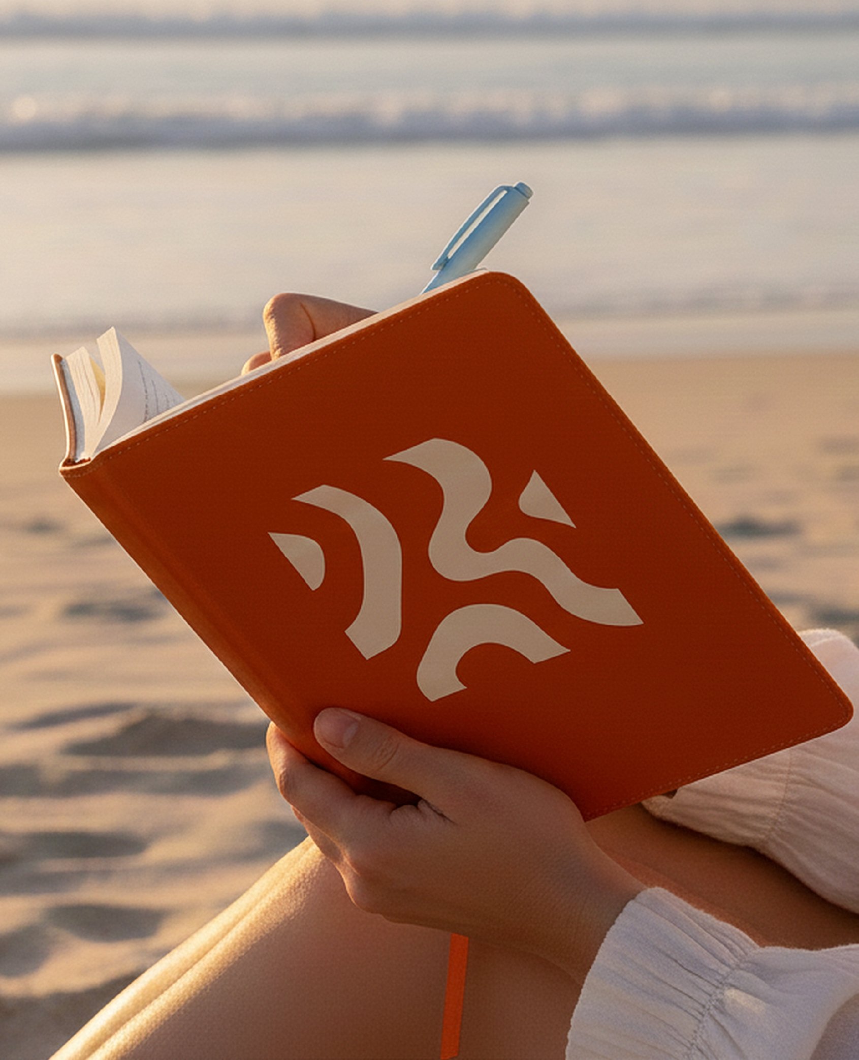
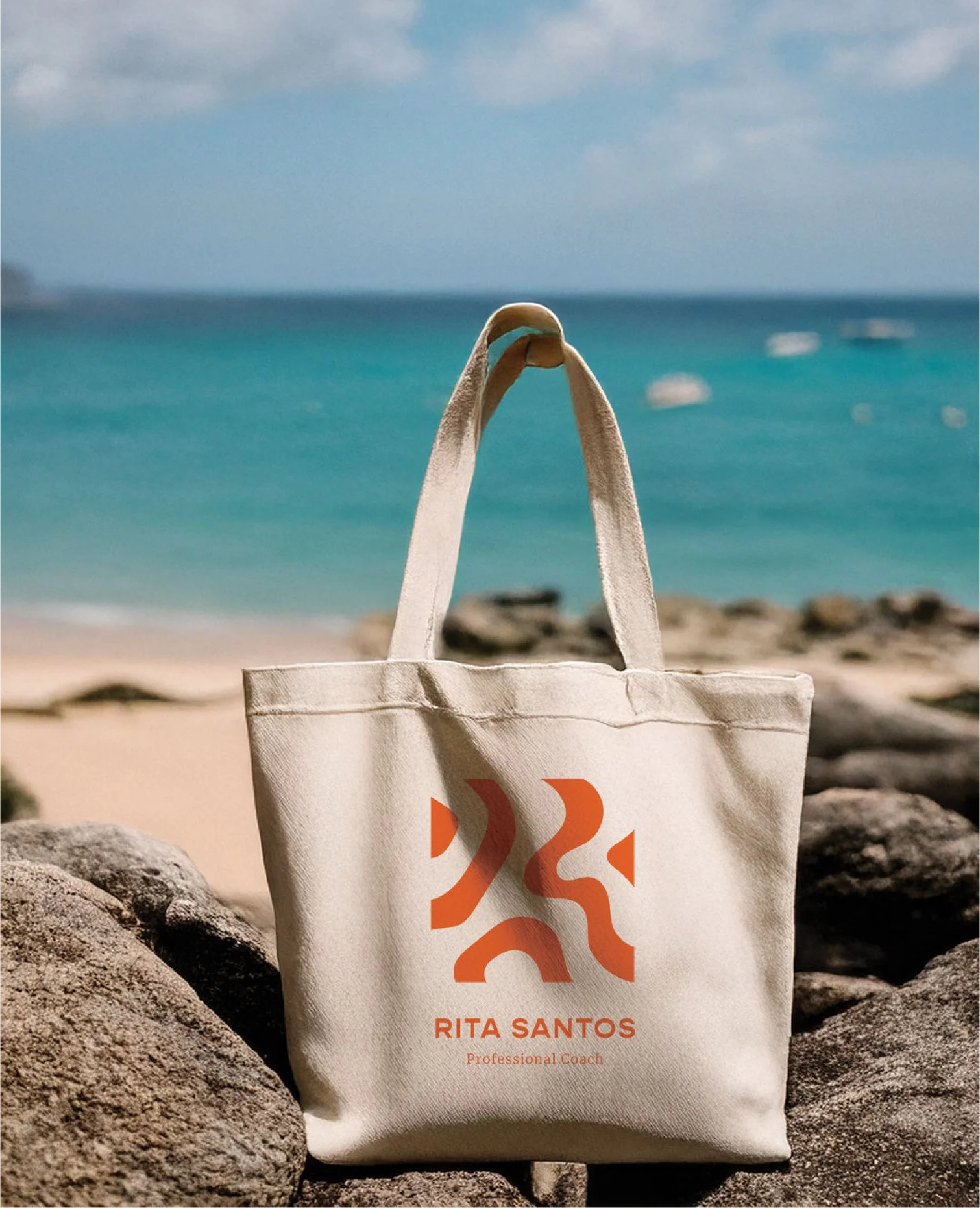
The final version of the logo was inspired by topographical maps that help you to understand the terrain you’re travelling through and where you’ll have to climb to reach your destination. They’re also inherently wavy and windy, much like the paths of life and change. Within the logo a subtle “R” and “S” spell out Rita’s initials. To keep the logo simple, I paired it with a reverse contrast sans serif type that reads as clean but approachable, and Albert Sans for support text to maintain legibility.
The color palette was inspired by nature and energy: a leafy green, sandy taupe, sky blue and a zesty orange that encapsulated the feeling Rita described of energy and movement. Along with a cosy off white and jet back for text, they create a color palette that transmits the feeling of grounded approachability with an energetic edge.
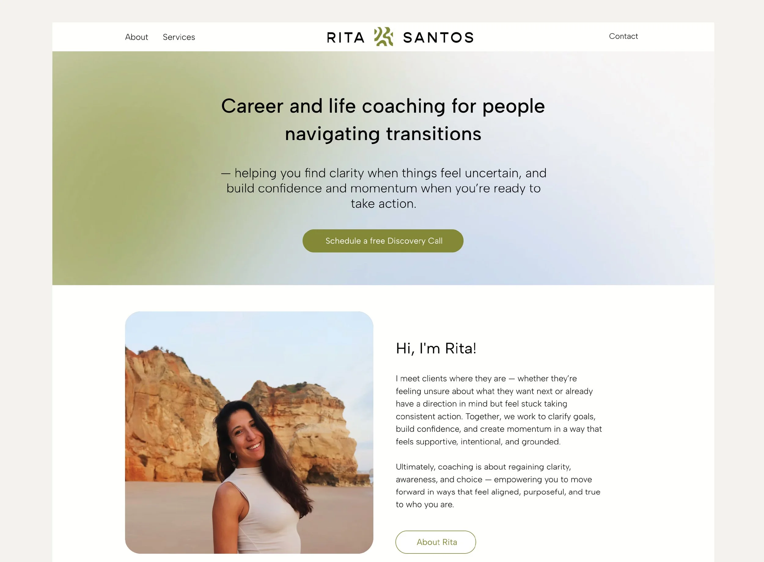
Rita’s website continues the brand experience with a focus on presenting information clearly, following the natural flow of a potential client’s thought process when looking to hire a professional coach and clarifying frequently asked questions.
Browse more projects:
-
![]()
Creating a clear positioning and service offering for Avalon’s Sales Advisory
Service design for Avalon Advisory
-
![]()
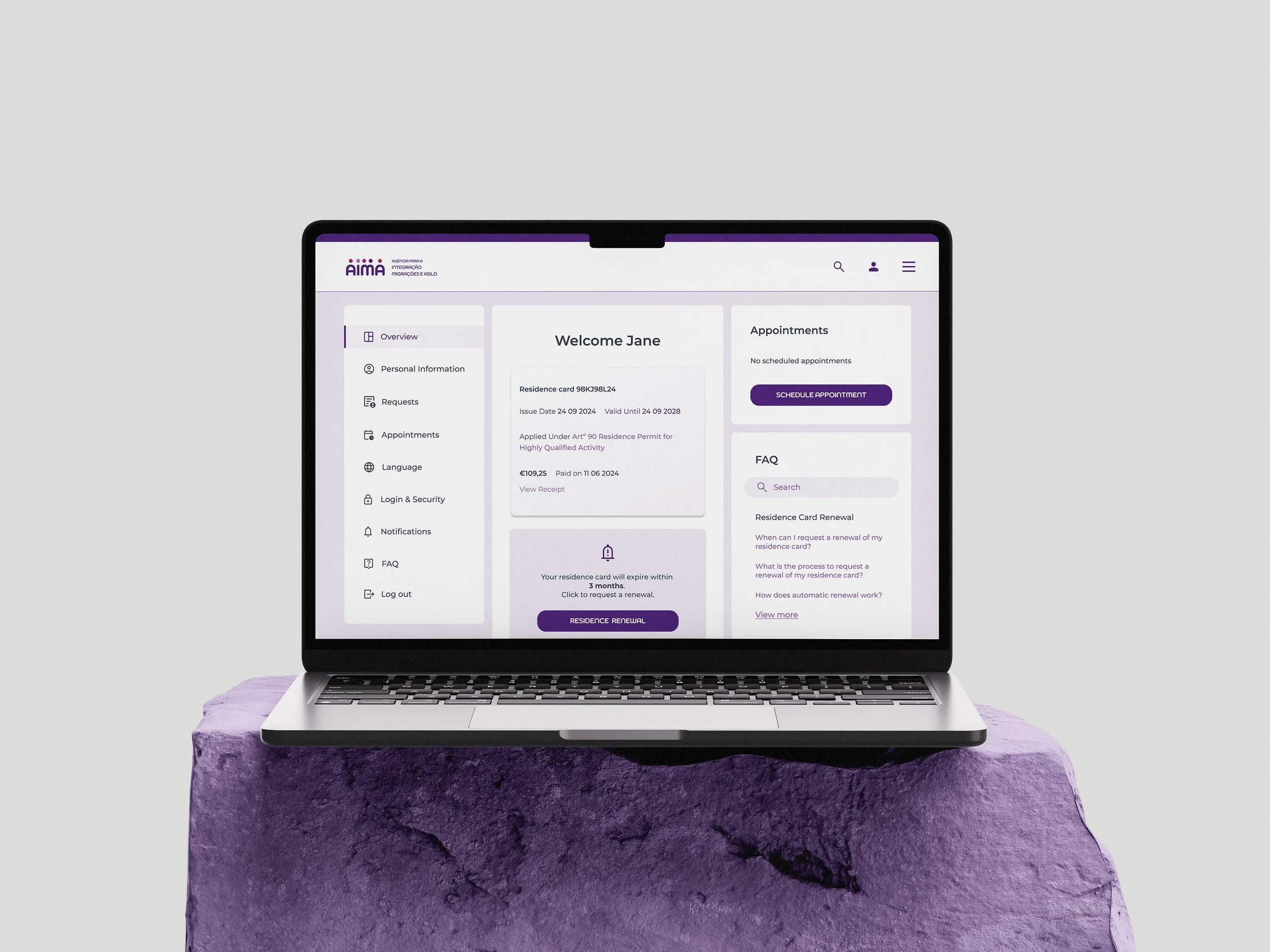
From Chaos to Clarity: Redesigning Portugal's Residence Renewal Experience
Service design for AIMA Portugal
-
![]()
A branding brief that revealed a service design opportunity
Service design for Rita Santos Coaching
-
![]()
Avalon Advisory
Brand identity for a commercial consultancy working with early stage B2B SaaS companies
-
![]()
The Joy Spot
Brand identity for a space dedicated to female pleasure in Lisbon